Wednesday, 30 March 2011
Tuesday, 29 March 2011
Images for Advertisement
These are a collection of a few photos I thought really captured the style of the brand.
Advertisement: Wildfox
My Chosen Brand
I love this brand as it complements the slightly vintage style of my magazine.
website: www.wildfoxcouture.co.uk/
I love this brand as it complements the slightly vintage style of my magazine.
website: www.wildfoxcouture.co.uk/
Saturday, 26 March 2011
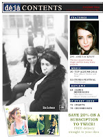
Final Draft of Table of Contents
Minor Changes
I added a page number to the contents page as its a very important for a magazine and very conventional. I also added a very light brown tint to the page, complementing the mood of the whole magazine and making it appear realistic.
Other Content Pages
Second Drafts of Table of Contents
I made many changes to the contents page. I first made a contents bar, with the magazine title, the date, the issue number and the website written on it. This helped shape my page in a more sophisticared way, and made the page appear realistic. I also cropped the images so that I could fit more on the page. Moreover, I put an image on 'Amy Jackson' on the feature section since she is featured in my double page spread. Furthermore, I inserted page numbers in bold with a shadow effect so that it would stand out from the image. Additionally, I created a colour scheme, with the colour pink, as this is a part of my branding. Lastly, I inserted a subscription box.

Friday, 25 March 2011
Thursday, 24 March 2011
Final Front Covers
After looking at the front covers, I noticed (as well as my teacher, Mr Lau) a few errors with the second draft and sorted them out.
The last coverline was grammatically incorrect and slightly confusing. Before, it was: 'Rising Star/Adele Out List Of/The Most Powerful/Artists'. The word 'and' was missing after 'Adele'. Also, there was an issue with the word 'Powerful' as it was a word reserved for business or politics. Thus, I used the word 'Influential' instead. The words 'albums of the' needed a thicker outline, as it was hard to read with the dark background. The words 'the new girl in town' needed a drop shadow, so I added it, so it would stand out from 'Amy Jackson'. The reason I changed the colour to pink was so it would match the colour of the pink writing on my DPS.
Similarly to the point above, the coverline was grammatically incorrect so I had to change it. I also added a black drop shadow to 'Amy Jackson' so that it could stand out more, and make it look more interesting, since the font was quite simple.
Other Finals
Wednesday, 23 March 2011
Second Drafts of Front Cover
The changes I've done to create a second draft included masthead, cover-lines, name of artist and bar code.
Masthead
For the masthead, I changed the colour and filled the text box with colour. This makes the magazine title easier to read and eye-catching. It also makes it look more like an icon and easy for the reader to familiarize with it. Additionally, it complements the tone and colour of the magazine.
Cover Lines
For the cover lines, I changed the alignment on the sepia magazine to centre. This challenges the conventions of magazine covers, making it different and interesting. It's also more eye-catching. However, I kept it the same as on the black and white magazine, because I felt that it complemented the image a lot more. Moreover, I changed the font of 'Amy Jackson' on the sepia cover, as I feel it complements the mood of the page and brings an interesting touch. It's also, again, unconventional, but in a way that I feel works.
Bar Code
I added a bar code because, of course, all magazine covers need it. I also added a website it and price to it. This is a major convention for the magazine cover, meaning it was very important I had it on my cover.
Tuesday, 22 March 2011
Sunday, 20 March 2011
Friday, 18 March 2011
Saturday, 12 March 2011
Thursday, 10 March 2011
Subscribe to:
Comments (Atom)


