Thursday, 7 April 2011
Wednesday, 30 March 2011


Tuesday, 29 March 2011
Images for Advertisement

These are a collection of a few photos I thought really captured the style of the brand.
Advertisement: Wildfox
My Chosen Brand
I love this brand as it complements the slightly vintage style of my magazine.
website: www.wildfoxcouture.co.uk/
I love this brand as it complements the slightly vintage style of my magazine.
website: www.wildfoxcouture.co.uk/
Saturday, 26 March 2011
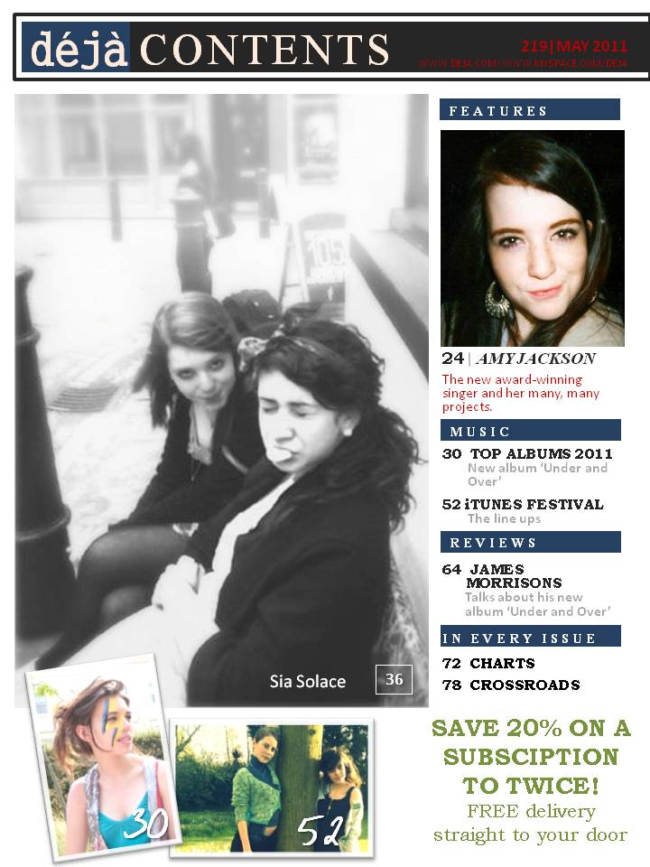
Final Draft of Table of Contents

Minor Changes
I added a page number to the contents page as its a very important for a magazine and very conventional. I also added a very light brown tint to the page, complementing the mood of the whole magazine and making it appear realistic.
Other Content Pages
Second Drafts of Table of Contents


Friday, 25 March 2011


Thursday, 24 March 2011
Final Front Covers
After looking at the front covers, I noticed (as well as my teacher, Mr Lau) a few errors with the second draft and sorted them out.

The last coverline was grammatically incorrect and slightly confusing. Before, it was: 'Rising Star/Adele Out List Of/The Most Powerful/Artists'. The word 'and' was missing after 'Adele'. Also, there was an issue with the word 'Powerful' as it was a word reserved for business or politics. Thus, I used the word 'Influential' instead. The words 'albums of the' needed a thicker outline, as it was hard to read with the dark background. The words 'the new girl in town' needed a drop shadow, so I added it, so it would stand out from 'Amy Jackson'. The reason I changed the colour to pink was so it would match the colour of the pink writing on my DPS.

Similarly to the point above, the coverline was grammatically incorrect so I had to change it. I also added a black drop shadow to 'Amy Jackson' so that it could stand out more, and make it look more interesting, since the font was quite simple.
Other Finals
Wednesday, 23 March 2011
Second Drafts of Front Cover


The changes I've done to create a second draft included masthead, cover-lines, name of artist and bar code.
Masthead
For the masthead, I changed the colour and filled the text box with colour. This makes the magazine title easier to read and eye-catching. It also makes it look more like an icon and easy for the reader to familiarize with it. Additionally, it complements the tone and colour of the magazine.
Cover Lines
For the cover lines, I changed the alignment on the sepia magazine to centre. This challenges the conventions of magazine covers, making it different and interesting. It's also more eye-catching. However, I kept it the same as on the black and white magazine, because I felt that it complemented the image a lot more. Moreover, I changed the font of 'Amy Jackson' on the sepia cover, as I feel it complements the mood of the page and brings an interesting touch. It's also, again, unconventional, but in a way that I feel works.
Bar Code
I added a bar code because, of course, all magazine covers need it. I also added a website it and price to it. This is a major convention for the magazine cover, meaning it was very important I had it on my cover.
Tuesday, 22 March 2011


Sunday, 20 March 2011

Friday, 18 March 2011
Saturday, 12 March 2011
Thursday, 10 March 2011
Thursday, 17 February 2011


Saturday, 12 February 2011


Thursday, 10 February 2011
Thursday, 3 February 2011
First Draft of DPS [Text]
At 19, the beautiful, Grammy Award-winning singer-songwriter Amy Jackson translates her awe for soulful sixties divas into a captivating style. Tibyaan Nassir revels in her unvarnished truth.
Wherever she is, Amy is, undoubtedly, a south London girl, with the swag, the attitude and not-so-perfect vocabulary to match. (“I can be rather presumptuous at times,” she teased.) When she found out a boyfriend had cheated on her, she tracked him down in Nando’s and punched the hell out of him. (“Fools and Their Tiny Things,” her hit single, was written about the breakdown of that relationship.)
Amy loathed her music teacher in high school (“He kept telling me to breathe properly when singing and that it was okay to look fat!”)
Fatefully, her mother couldn’t enrrol her into Brit School, a performing-arts school whose graduates include Amy Winehouse and Leona Lewis. “Yeah, it upset me. Then again, everything happens for a reason. I wouldn’t be where I am today, talking to you guys, if I had gone to Brit school. Hell, I would be touring America with my third album!” she joked.
She went through the fashion rites through school life as a London girl. “From twelve to thirteen I was just crazy,” she remembers. “Cute checkered dresses. Big round glasses. Two short ponytails. I called myself ‘Cute Lil’ Misfit’ haha. Then I really got into hip hop and R&B and became a Rude girl – in Adidas and big hoop earrings, with a spit curl! Tiny Nike backbacks. Mine was black and had like a massive little ‘I <3 Me’ key ring”.
However stylish and hip her teenage life was, Amy admits that she would hide in her room listening to Tracy Chapman and still admires the Spice Girls. “It was always pop music,’ she says. “I would dance ro Destiny’s Child, and oh my God, there was a time when I was obsessed with Usher. I always imagined singing with him on stage, being his ‘Bad Girl’ and ‘Boo’. Wow. I was obviously too cool.”
But Amy’s musical epiphany came at fifteen. “I remember being home alone in the bathroom and singing. I loved the echoey-feel of the room, you know? When suddenly you sound like some long lost sister of Beyonce or something. I was actually singing ‘Dangerously in Love’. I loved it, the feeling of letting out this roaring voice”. Her mother then came home, hid behind the door and recorded her voice. “I was so mad at her when I found out she was spying on me. I felt kinda humiliated. But when I heard it over, while considering deleting it, it felt... strange. It felt kinda refreshing. I wanted to share this feeling with the world. People listening to me on their iPods.
In Los Angeles for the Grammy Awards, Amy was as independent as ever. Her mother was not there to see her. "It would be great to have her here," she explains, "but there were other matters to be handled." Instead, she rings her from the red carpet to announce that she has won her first Grammy (for Best Female Pop Vocal Performance). Her mother just screams and cries and laughs (it would be difficult to hear anything else above the roar). By the time she performs, Amy has beaten out the Jonas Brothers and her friend Taylor Swift for Best New Artist.


Tuesday, 1 February 2011
Saturday, 22 January 2011
DPS Mock up
Again, the text is just there to see how it will look like as a whole. It's not mine. But the layout is what I might want for my DPS.

DPS Layout Ideas
I tried experimenting with the few pictures I took. I looked very closely to the layouts in music magazines, specifically Billboard's. The texts in the DPS mockup's aren't mine - they were taken from another magazine. I cropped it and put it in these so I could have an idea of what it would look like as a complete DPS. That's the only thing I copied directly from another magazine.
Thursday, 20 January 2011
DPS Photoshoot and Commentary
These are few photos I took. The mood is quite different from the initial plan. I might use one of these, which would mean taking on a different side of pop. Though, I might be doing another photo shoot soon.
Tuesday, 18 January 2011
Monday, 17 January 2011
Saturday, 15 January 2011
Wednesday, 12 January 2011
Subscribe to:
Posts (Atom)